
Customize radio buttons and checkboxes with CSS sprites
Do you want to use an image for both the ‘off state’ and the ‘on state’ for radio buttons or checkboxes (for example, when you want to give the user the ability to declare if he or she is a male or a female)? To make sure toggling between the ‘on’ and ‘off state’ goes smoothly, we strongly advise you to use CSS sprites. When you use CSS sprites, the ‘on state’ image is already loaded so it won’t load once you click the image (if you don’t use CSS sprites, visitors will face a blinking image which doesn’t look very smooth). Don't you want to use images /sprites, but CSS only? Check out this tutorial: How to customize radio buttons and checkboxes with CSS
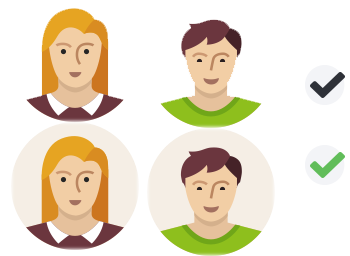
To replace a radio button or a checkbox with a sprite, you first need to create the sprite image. For this free tutorial, we use the following sprites:
Create the HTML
Once you’ve created your sprite images, you will need to create the HTML. Below you will find the HTML we created for this demo. If you need more information about this, consult the following article: Customize radio buttons and checkboxes with only CSS
<input type="checkbox" id="checkbox-default-1" name="checkbox-default" class="default">
<label for="checkbox-default-1">Checkbox 1</label>
<input type="checkbox" id="checkbox-default-2" name="checkbox-default" class="default">
<label for="checkbox-default-2">Checkbox 2</label>
<input type="checkbox" id="checkbox-default-3" name="checkbox-default" class="default">
<label for="checkbox-default-3">Checkbox 3</label>
Checkboxes HTML:
<input type="checkbox" id="check-1" name="checkbox-btns-sprite">
<label for="check-1" class="check"><span>1</span></label>
<input type="checkbox" id="check-2" name="checkbox-btns-sprite">
<label for="check-2" class="check"><span>2</span></label>
<input type="checkbox" id="check-3" name="checkbox-btns-sprite">
<label for="check-3" class="check"><span>3</span></label>
Create the CSS
Once the HTML is created, it’s time to replace the label texts with the sprite. You do this by starting with setting the width and height of the image (not the entire sprite’s width and height, but only from the default image). Use background-image: url(); to invoke the sprite, add the background-repeat: no-repeat; and set the background-position: 0 0;. Lastly you want to add a negative text-indent so the label texts won’t be visible. Now your default image, which will represent the ‘off state’, will be displayed.
Notice that we’ve used the same HTML as we’ve used for the CSS only radio buttons and checkboxes. The only difference is the class and an extra span element for the checkboxes.
input[type=radio]{display:none;}
input[type=checkbox]{display:none;}
Radio Buttons:
input[type=radio] + label.male{
display:inline-block;
cursor: pointer;
outline: 0;
width: 128px;
height: 128px;
background-image: url(img/male.png);
background-repeat: no-repeat;
background-position: 0 0;
text-indent: -99999px;
}
Checkboxes:
input[type=checkbox] + label.check{
display:inline-block;
cursor: pointer;
outline: 0;
width: 40px;
height: 40px;
background-image: url(img/checkbox.png);
background-repeat: no-repeat;
background-position: 0 0;
margin-right: 25px;
text-align: center;
font-weight: bold;
}
When you’ve managed to get the label replaced by the default image, it’s time to add the ‘on state’ which will be the state where the radio button or checkbox is clicked and the image must change to the second version of the image, which is positioned at the bottom of the sprite. This is done by changing the following CSS: background-position: 0 bottom;.
input[type=radio]:checked + label.male{background-position: 0 -128px;}
input[type=radio] + label.female{
display:inline-block;
cursor: pointer;
outline: 0;
width: 128px;
height: 128px;
background-image: url(img/female.png);
background-repeat: no-repeat;
background-position: 0 0;
text-indent: -99999px;
}
input[type=radio]:checked + label.female{background-position: 0 bottom;}
Checkboxes hover and checked CSS:
input[type=checkbox] + label.check span{vertical-align: -60px;}
input[type=checkbox]:checked + label.check{background-position: 0 bottom;}
When you click on your radio buttons or checkboxes, the sprite will do its job and will switch between the images within the sprite. Notice that we’ve added a span element for the checkboxes so we can give the text within that span a custom position, just below the image.
DEMO: Custom Radio Buttons using sprite background images
DEMO: Custom Checkboxes using sprite background image
We can imagine that you want to play & edit these demo's. View & edit these CSS radio buttons and checkboxes on JSFiddle.
Do you want to customize radio buttons and checkboxes using CSS only? Make sure you check out our article: Customize radio buttons and checkboxes with only CSS
Was this useful?


Resource categories
Share this resource
