
How to customize radio buttons and checkboxes with CSS
There are so many tutorials on the internet which help you to create custom checkboxes and radio buttons, but almost all of them use JavaScript or jQuery, which is totally redundant nowadays. If you want to give radio buttons and checkboxes a custom style but only want to use HTML and CSS (so no JavaScript or jQuery), then this is the perfect tutorial for you. Do you want to use sprite images instead of CSS? Check out the following tutorial: Customize radio buttons and checkboxes with CSS sprites.
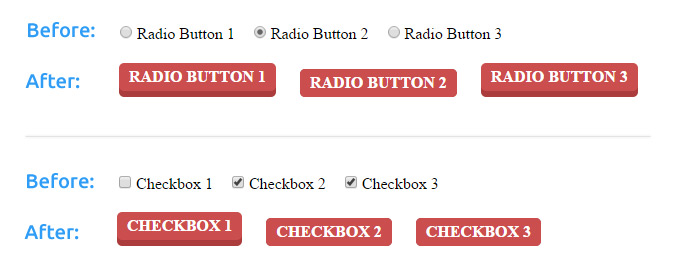
Let’s first take a look of what we’ll be creating:
Build the HTML
With this technique you will create radio buttons and checkboxes using the form input elements. The inputs will be hidden via CSS and, by adding labels and making these labels clickable, you can select or de-select the checkboxes or switch between radio buttons.
Before we can style anything, we need to create the radio buttons, checkboxes and labels using HTML. To ensure that when you click a label, the corresponding input is selected, you’ll need to add an ‘id’ attribute to the input and a ‘for’ attribute to the labels, which must both have the same value. To make sure the radio buttons or checkboxes will belong to the same group, you’ll need to add the ‘name’ attribute to the input elements and give them the same value. This will basically look like this:
<input type="radio" id="radio-btn-1" name="radio-btns">
<label for="radio-btn-1" class="btn">Radio Button 1</label>
<input type="radio" id="radio-btn-2" name="radio-btns">
<label for="radio-btn-2" class="btn">Radio Button 2</label>
<input type="radio" id="radio-btn-3" name="radio-btns">
<label for="radio-btn-3" class="btn">Radio Button 3</label>
Checkboxes HTML:
<input type="checkbox" id="checkbox-btn-1" name="checkbox-btns">
<label for="checkbox-btn-1" class="btn">Checkbox 1</label>
<input type="checkbox" id="checkbox-btn-2" name="checkbox-btns">
<label for="checkbox-btn-2" class="btn">Checkbox 2</label>
<input type="checkbox" id="checkbox-btn-3" name="checkbox-btns">
<label for="checkbox-btn-3" class="btn">Checkbox 3</label>
Add styles with CSS
First it’s time to start styling the radio buttons and checkboxes. We do this by using CSS adjacent sibling selectors, or the plus (+) sign. With an adjacent sibling selector, you select an element that directly follows the former element. The beauty about this is that it is supported by all major browsers (even Internet Explorer 7 and higher) and smartphones, so it will always work.
Now it’s time to hide the default radio buttons and default checkboxes. We do this by using the following CSS:
input[type=radio]{display:none;}
input[type=checkbox]{display:none;}
Once the default radio buttons and default checkboxes are hidden, we can start styling the labels using CSS. Notice that we’ve use the adjacent selector here to select the labels that directly follow the inputs.
input[type=radio] + label.btn{
padding: 5px 10px;
margin: 5px 10px;
display: inline-block;
text-transform: uppercase;
font-weight: 700;
outline: none;
position: relative;
-webkit-transition: all 0.3s;
-moz-transition: all 0.3s;
transition: all 0.3s;
background: #cb4e4e;
color: #fff;
box-shadow: 0 6px #ab3c3c;
-webkit-transition: none;
-moz-transition: none;
transition: none;
border: none;
border-radius: 5px;
cursor: pointer;
}
Style the checkboxes using CSS:
input[type=checkbox] + label.btn{
padding: 5px 10px;
margin: 5px 10px;
display: inline-block;
text-transform: uppercase;
font-weight: 700;
outline: none;
position: relative;
-webkit-transition: all 0.3s;
-moz-transition: all 0.3s;
transition: all 0.3s;
background: #cb4e4e;
color: #fff;
box-shadow: 0 6px #ab3c3c;
-webkit-transition: none;
-moz-transition: none;
transition: none;
border: none;
border-radius: 5px;
cursor: pointer;
}
Now that we’ve styled the ‘off state’ of the radio buttons and checkboxes, it’s time to make a little change as you hover over the label with your mouse and style the ‘on state’ of the inputs. This means that when you click on a checkbox or radio button, it will be selected and needs to have a different style. We create an ‘on state’ using the CSS pseudo-class:checked. Here’s how this works.
input[type=radio] + label.btn:hover{
box-shadow: 0 4px #ab3c3c;
top: 2px;
}
input[type=radio]:checked + label.btn{
box-shadow: 0 0 #ab3c3c;
top: 6px;
}
Checkboxes hover and checked CSS
input[type=checkbox] + label.btn:hover{
box-shadow: 0 4px #ab3c3c;
top: 2px;
}
input[type=checkbox]:checked + label.btn{
box-shadow: 0 0 #ab3c3c;
top: 6px;
}
Now that the custom CSS-only radio buttons and custom CSS-only checkboxes are finished, you can check the results in the following demos:
DEMO: Custom CSS Radio Buttons
Demo: Custom CSS Checkboxes
We can imagine that you want to play & edit these demo's. View & edit these CSS radio buttons and checkboxes on JSFiddle.
Do you want to customize radio buttons and checkboxes using images or sprites? Make sure you check out our article: Customize radio buttons and checkboxes with CSS sprites
Was this useful?


Resource categories
Share this resource
